
Covid-19 in Illinois
Update (April 24, 2021): The data presented on this page was last updated May 9, 2020. No further updates are planned.
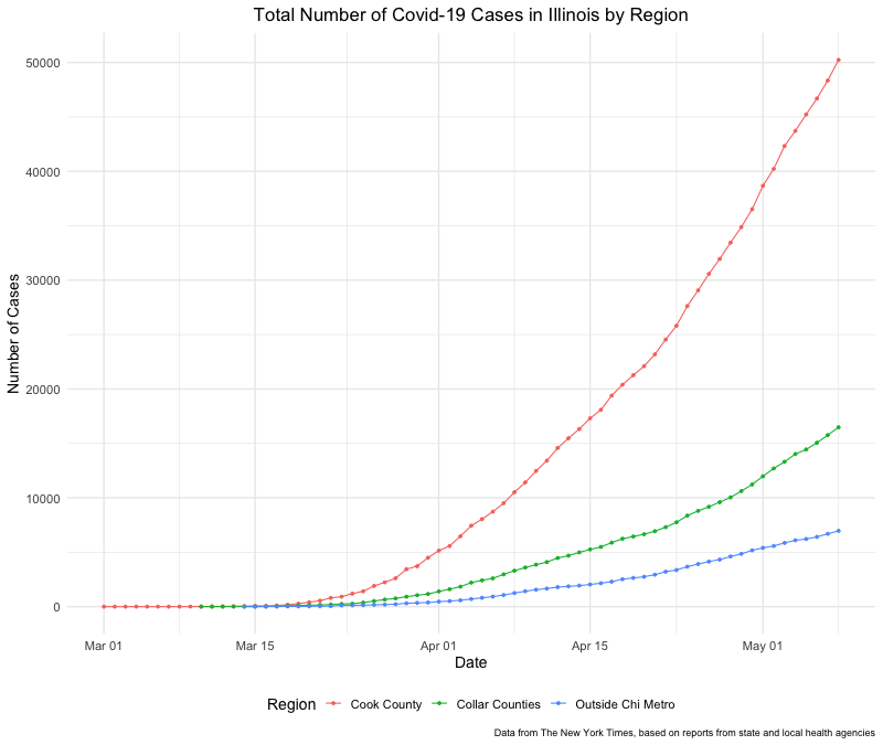
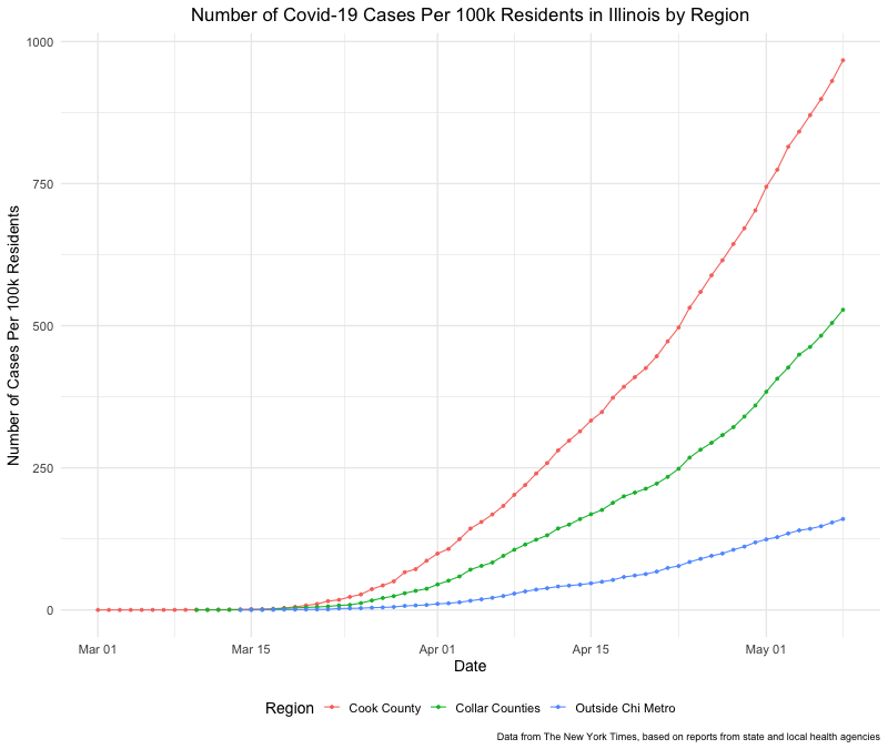
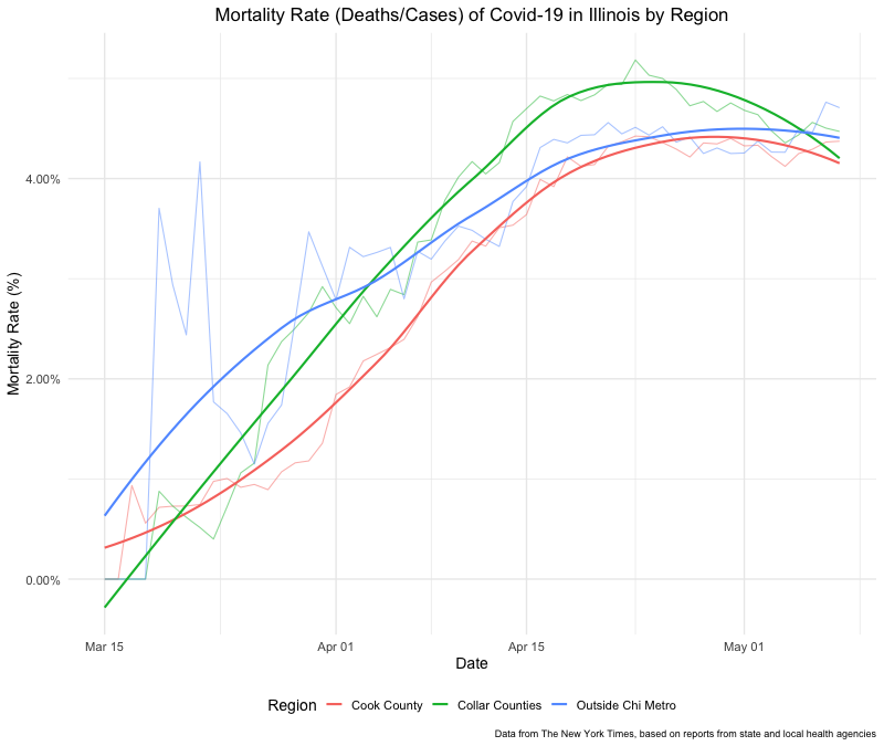
Given all the charts out there tracking the cases of Covid-19 (coronavirus) across countries and across states in the US, I was curious at looking more specifically at what’s going on within Illinois. Specifically, I wanted to know what Covid-19 cases look like within the city of Chicago compared to the counties that surround Cook county where Chicago is located (i.e., the five “collar counties” of DuPage, Kane, Lake, McHenry, and Will), and within the rest of Illinois.
Luckily, the New York Times recently publicly released the data they’re using to track Covid-19 cases across the US. These data include county-specific numbers of cases and deaths.
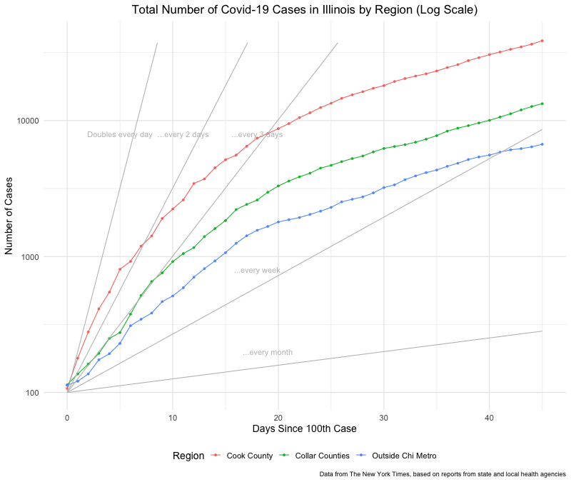
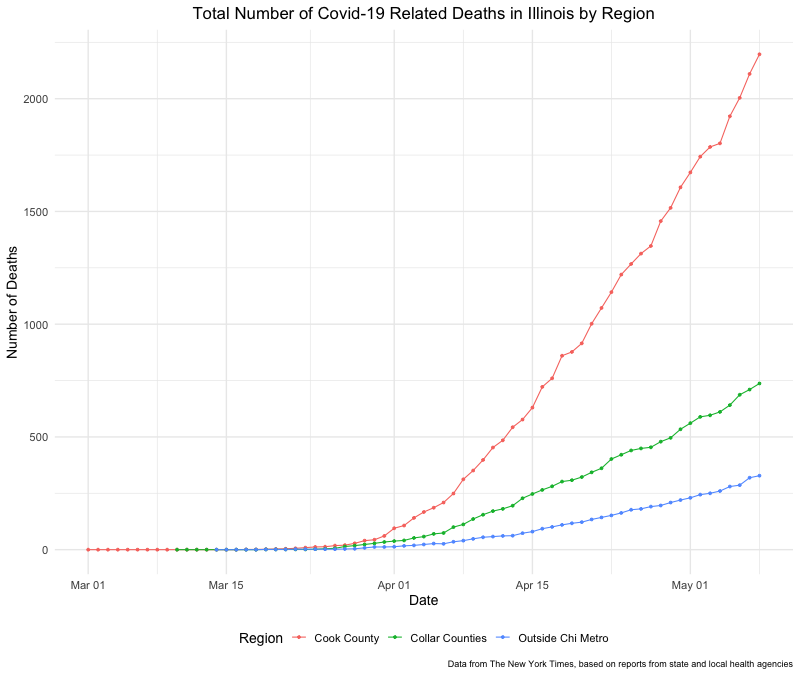
Below are graphs generated using this data. Specifically, overall cases, cases per capita, overall deaths, and the mortality rate by region of Illinois (i.e., Cook county, collar counties, and outside Chicago metropolitan area). The R script used to create these graphs can be found here on GitHub. I will try to update these graphs regularly while time permits.
Data Sources
Data on number of cases and deaths by county comes from the New York Times’ GitHub repository.
County and state populations for calculating cases per capita come from the following Wikipedia pages (population counts last pulled from these pages on March 29, 2020)1:
-
Total population used, not 2018 estimated population. ↩︎